
Alliron Studio

Hollow State

Driftwood Whiskey
About this project
Driftwood is a small-batch American whiskey inspired by the raw, untamed character of the Mississippi River. The concept pays tribute to the centuries-old journey of wood, barrels, and trade that traveled downstream, shaping the spirit of the land and the people who lived along its banks. The bottle takes inspiration from eroded bark textures and river-worn wood. The embossed glass pattern evokes the cracked surface of driftwood, while the warm amber tone reinforces the idea of a spirit aged in American oak. A custom medallion seal and engraved neck ring add a tactile, heritage-driven character. The label blends traditional illustration with topographic textures referencing the Mississippi River route, from Kentucky to New Orleans. The muted palette, engraved artwork, and aged map details communicate authenticity, history, and craft.

Tres Torres
About this project
Tres Torres, a gin born at the meeting point of man and nature. Tres Torres (Three Towers) is a London Dry Gin project built around the symbolism of three historic towers. Each tower represents time, tradition, and protection, standing as quiet guardians of nature. Together, they form the conceptual backbone of the brand, offering a clear yet flexible framework for storytelling. The visual identity brings together two worlds, the human-made and the natural, merging them to express the balance at the heart of gin making. This duality reflects the spirit itself: a product defined by human precision and knowledge, yet deeply dependent on the botanicals and raw materials provided by nature. Rather than treating these elements as opposites, the project explores how they can coexist and complement one another. A key design decision was to place the illustrated towers at the centre of the visual language, allowing them to act as a strong symbolic anchor. Their architectural presence introduces structure, rhythm, and stability to the label, creating a sense of permanence and heritage. Surrounding natural elements are integrated more fluidly, softening the composition and adding warmth, depth, and narrative. This contrast reinforces the idea of a spirit shaped through collaboration between human intention and the natural environment. Typography was approached with the same sense of restraint and balance. Elegant, understated type choices leave space for the illustration to breathe while conveying quiet confidence and timelessness. The hierarchy is clear and deliberate, ensuring legibility while supporting the overall atmosphere of the brand rather than competing with it. Materiality and detail play an important supporting role throughout the project. Subtle textures, finishes, and graphic details were carefully considered to enhance tactility and elevate the perceived quality of the product. These elements were used sparingly, reinforcing a premium feel without relying on excess decoration or visual noise.

Malefico Tequila
About this project
The name Malefico, meaning “evil” in Spanish, draws from the mystical and symbolic side of Mexican culture, a world where darkness and ritual coexist with beauty and craft. This concept became the foundation for the brand’s visual identity. The name evokes mystery, duality, and quiet power, qualities that challenge the conventional image of tequila as merely festive or rustic. Instead, it introduces a more introspective and spiritual dimension to the category. Rooted in the mystical traditions of Jalisco, the brand explores the tension between light and shadow, purity and depth, a theme that guided every design decision. The faceted bottle was sculpted to embody this duality: sharp yet refined, modern yet timeless. Its geometry captures and divides light, creating a dynamic interplay of brightness and shadow that visually expresses the spirit of Malefico.

Nova Mocktails
About this project
A fresh and sophisticated take on alcohol-free cocktails. With the growing popularity of mindful drinking, Nova Mocktails stands out as a vibrant and elevated option for those seeking a full sensory experience, without the alcohol. The visual identity captures this essence through soft gradients and a lively color palette that evoke freshness and vitality. Paired with dynamic imagery and clean typography, the design reflects Nova’s energetic and modern spirit, a celebration of taste, freedom, and contemporary lifestyle.
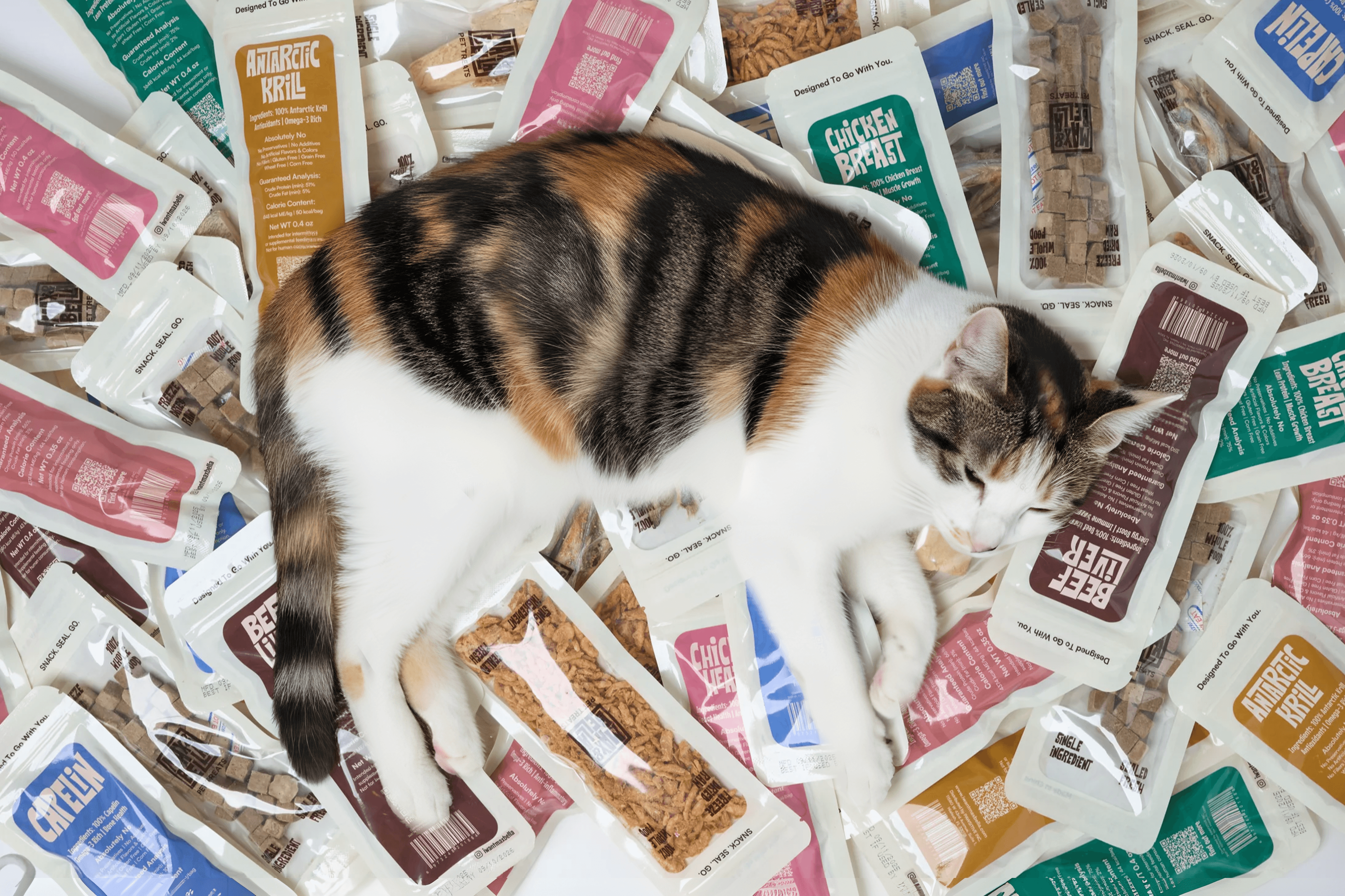
Max&Bella - Petfood Packaging
About this project
Max & Bella is a pet food packaging project developed for a U.S.-based brand focused on high-quality, natural nutrition for pets. The main goal of the project was to create a clear, honest, and functional packaging system that communicates each product’s core ingredient at a glance, while maintaining a cohesive and premium visual identity across the full range. The design is built around transparent single-serve pouches, allowing the real product to remain visible and reinforcing a sense of trust and natural quality. A structured color-coding system helps differentiate flavors, while straightforward typography and a clean hierarchy ensure high legibility and everyday usability. The result is a modular, recognizable, and scalable packaging system, designed to work effectively in both e-commerce and retail environments, and aligned with the brand’s values of quality, simplicity, and animal wellbeing.
How I work
Every project begins with understanding your brand, its story, purpose, and what makes it different. From there, I shape a clear creative direction through research, moodboards, and conceptual exploration.
My approach combines strategic thinking with a strong sense of visual composition, ensuring that every detail reflects the essence of the brand. I move fluidly between concept, design, and 3D visualization, creating identities and packaging that not only look good but also communicate meaning.
Services
Branding
+
Your brand is more than a logo, it’s how people recognize and connect with you. I help you define your identity through strategy, naming, typography, and visual systems that express who you are and make your brand instantly recognizable.
Packaging
+
Packaging is often the first physical interaction people have with your brand. I design packaging that not only stands out on the shelf but also communicates your values through materials, structure, and storytelling, turning products into memorable experiences.
Web Development
+
A strong online presence is essential for any modern brand. I design and develop custom websites that combine clean aesthetics with smooth functionality, helping you present your brand clearly and convert visitors into clients.
3D Visualization
+
Before producing anything, realistic 3D visuals let you see and feel the final result. I create detailed product renders and scenes that help you communicate your concept, showcase packaging, or enhance presentations with a high-end look.
Design Strategy
+
Good design starts with a clear direction. Through research, positioning, and creative guidance, I help you build a solid foundation for your brand, ensuring that every visual decision aligns with your goals and speaks to your audience effectively.
The Journal
(Blog)


